Solar landing page
Solar landing page
Boosting engagement by answering users’ key questions, refining visuals and adding interactivity
1 / Problem
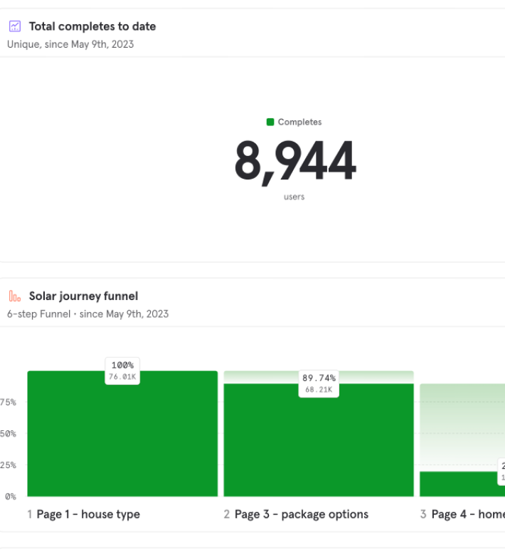
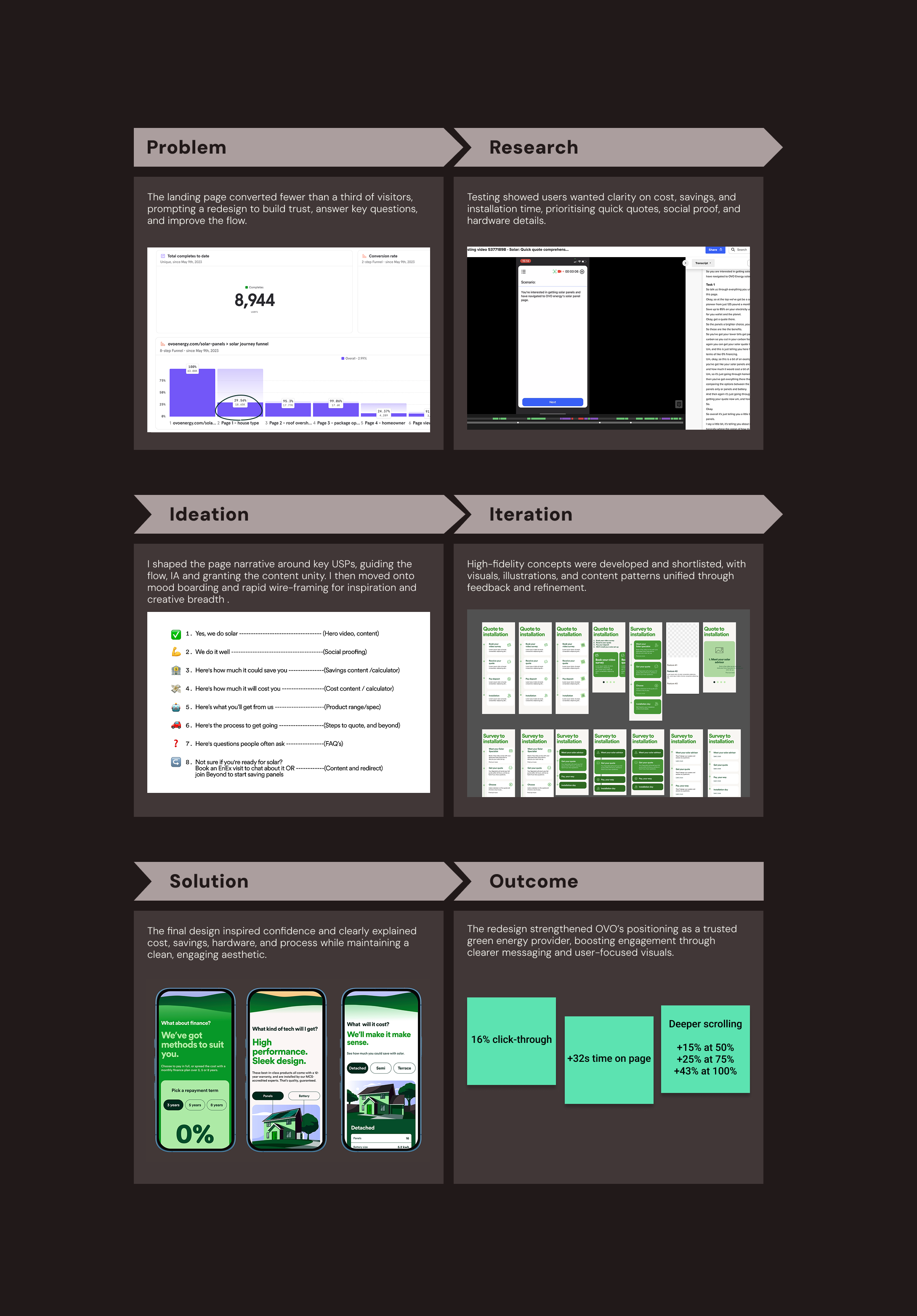
The original landing page was underperforming—fewer than one-third of visitors progressed to the cost estimate tool, limiting conversion. We needed to inspire trust, answer core questions, and improve the flow.

+ + +
2 / Testing
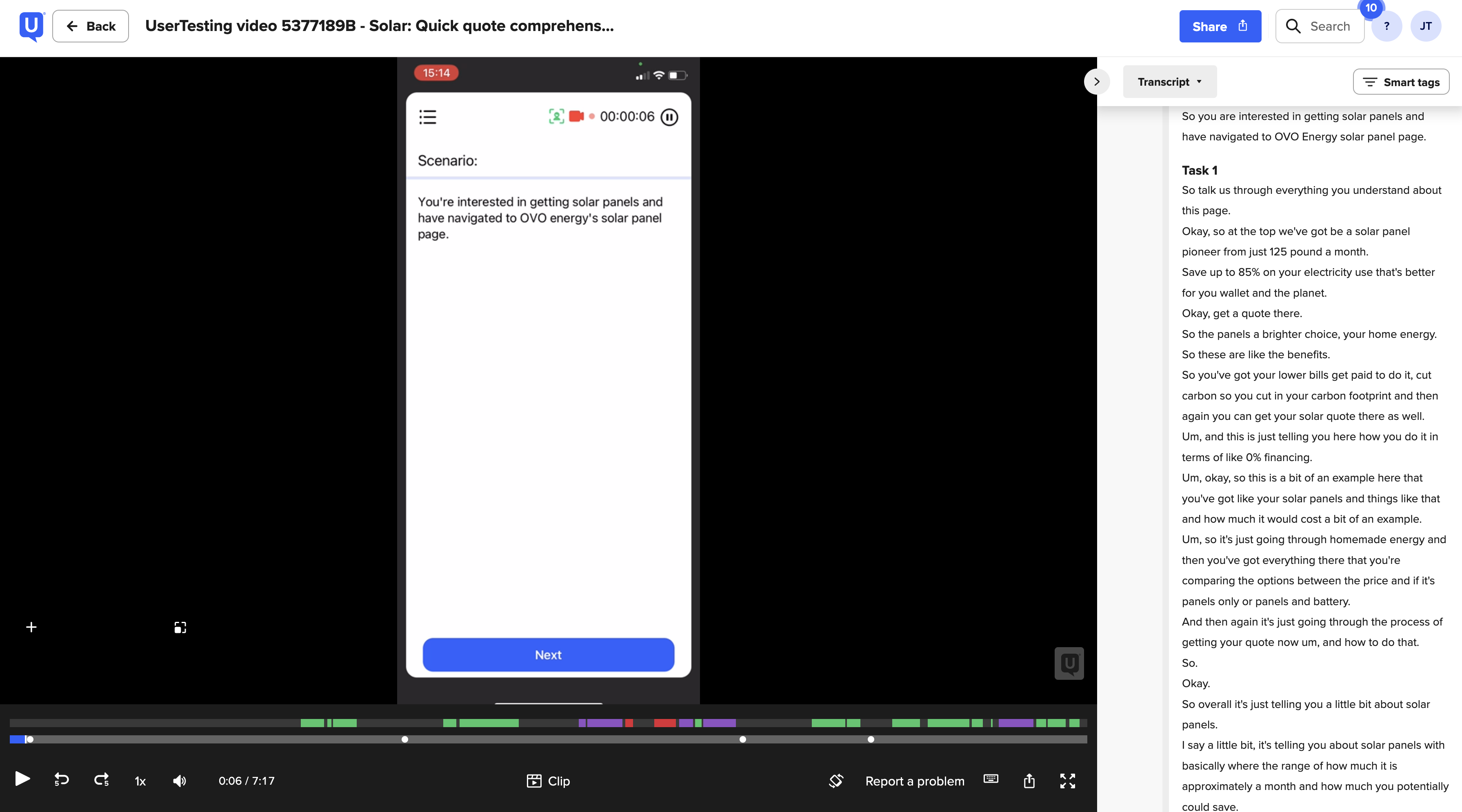
Usability tests showed users wanted more clarity on cost, savings, and installation time.
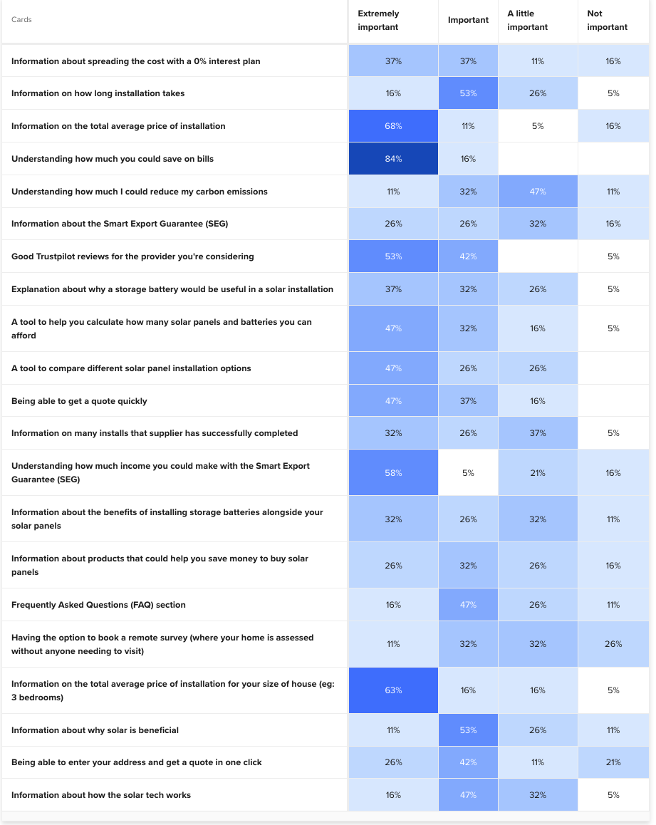
Card sorting revealed the top priorities: savings info, quick quotes, social proof, and hardware details.
+ + +
3 / Design
We began by shaping the page narrative—making sure it flowed, highlighted USPs at the right time, and told a coherent story.
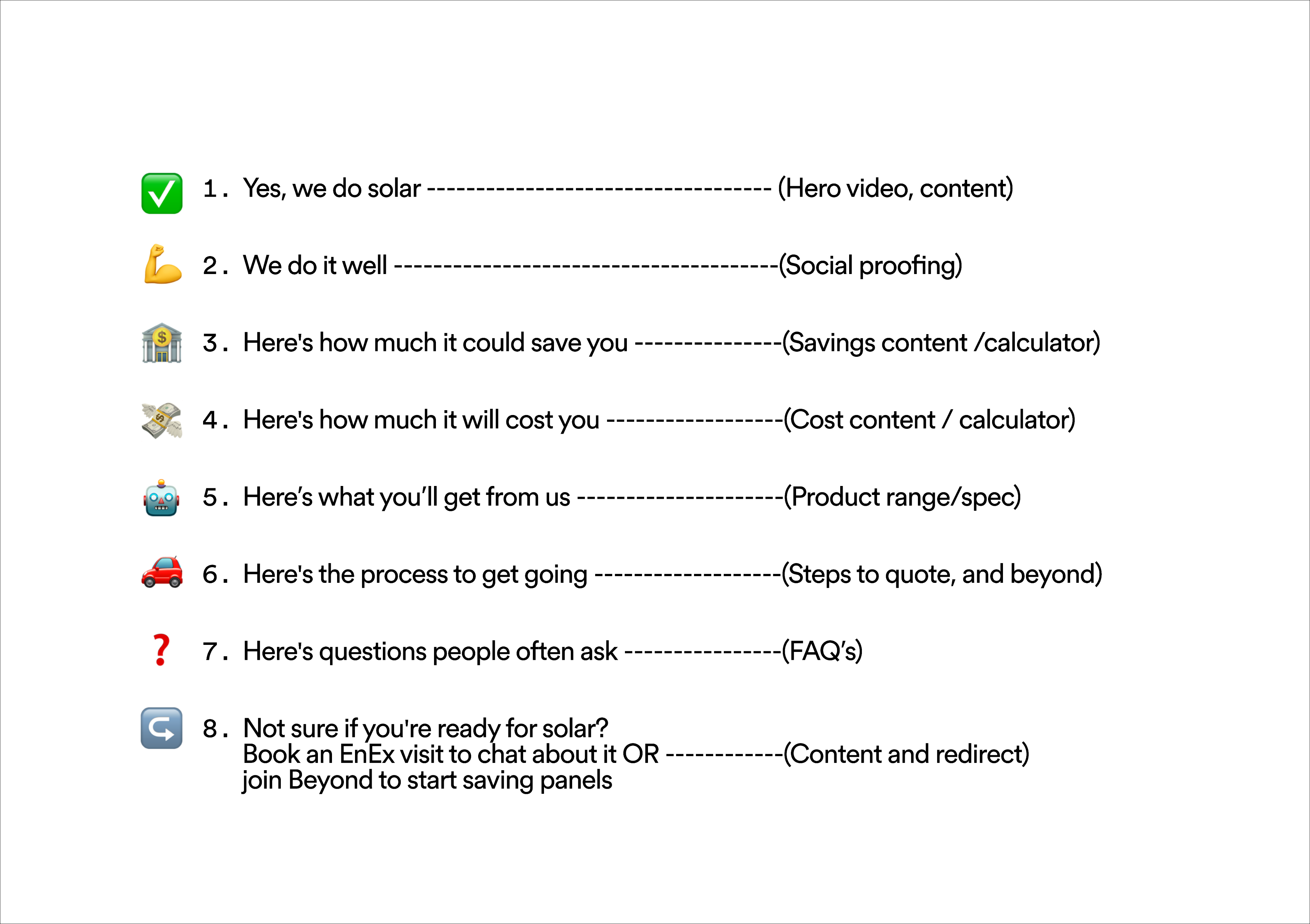
We explored multiple IA sketches, refined through peer feedback, then moved into mood-boarding and wireframes.
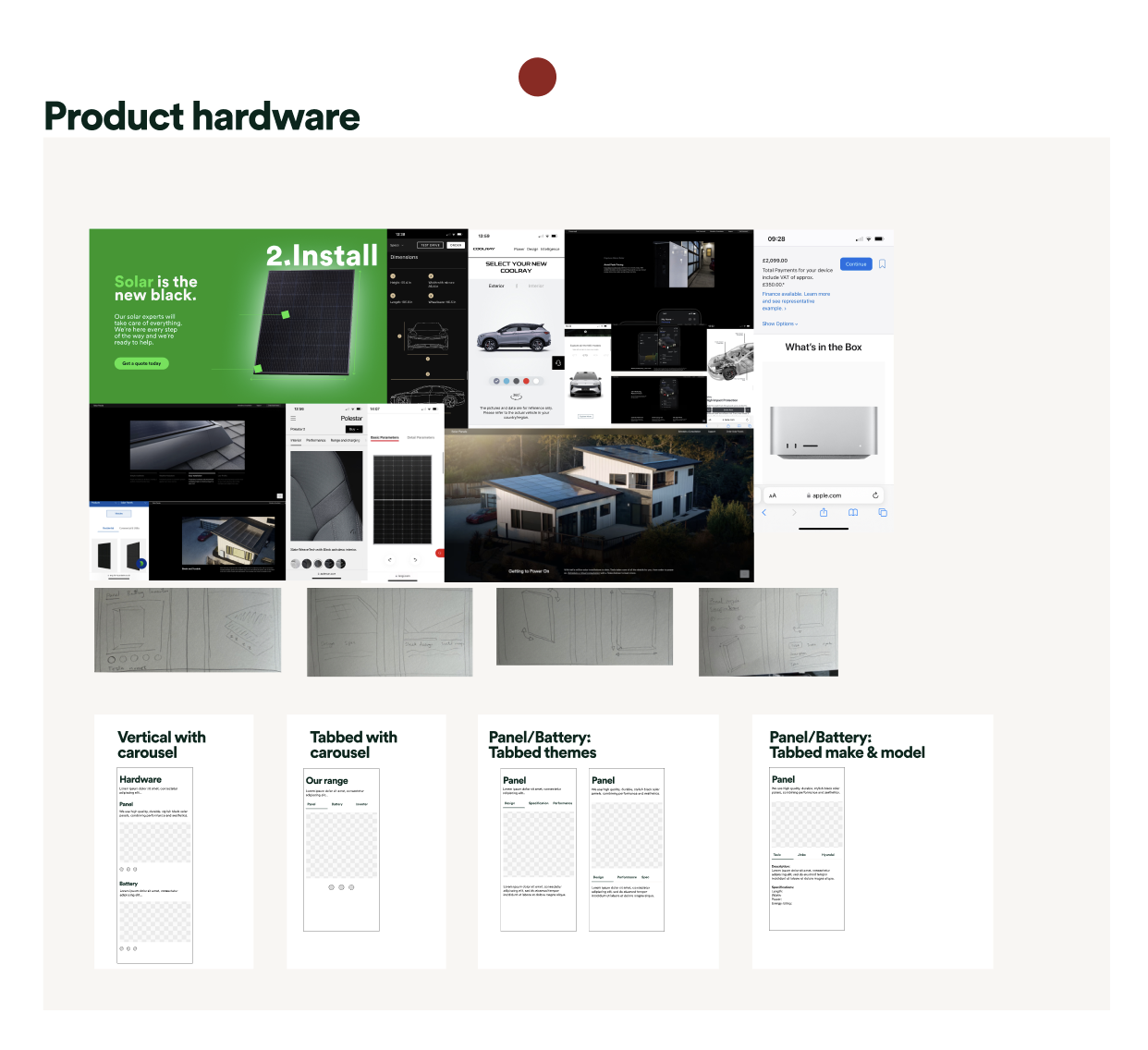
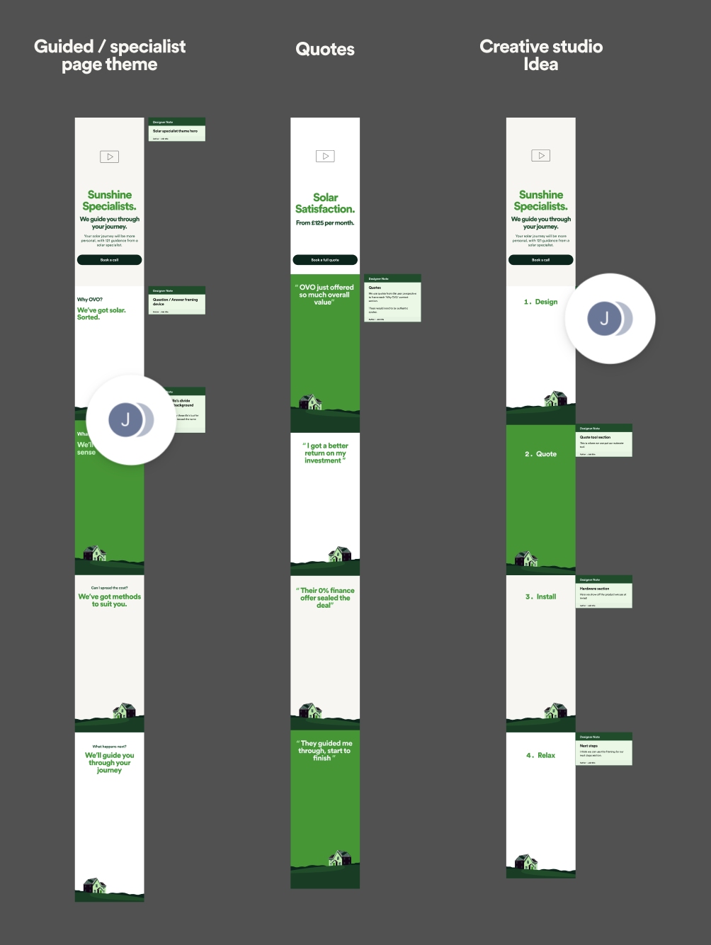
High fidelity explorations followed, before shortlisting designs to take forward.
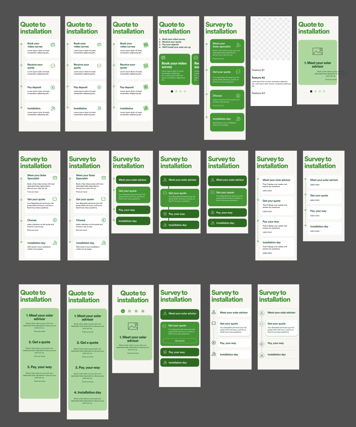
To unify the page, I worked with the team on consistent visuals, illustration, and content patterns. Prototypes were tested and refined in cycles.
+ + +
4 / Accessibility
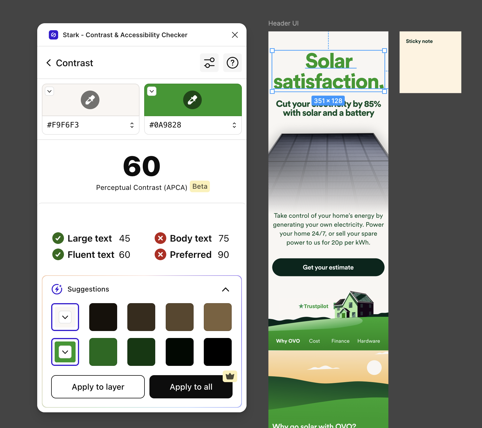
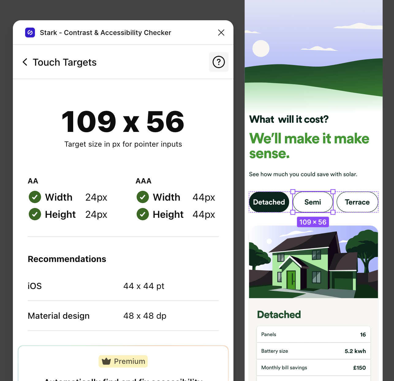
Accessibility was baked into refinement: AA contrast checks with Stark, clear page landmarks, logical focus order, labeled elements, and 44px touch targets. I also ran guerrilla screen reader tests in Figma and addressed issues immediately.
+ + +
5 / Solution
The final design inspired confidence, sold OVO’s value, and addressed the key user questions—cost, savings, hardware, and process—while keeping visuals clean and engaging.
+ + +
6 / Outcome
The redesign strengthened OVO’s positioning as a trusted green energy provider. Stakeholders saw the design as fresh and user-focused, making a strong case for OVO through messaging, visuals, and interactions. Users showed higher engagement:
- +16% click-through
- +32s time on page
- Deeper scrolling (+15% at 50%, +25% at 75%, +43% at 100%)
+ + +
7 / Reflection
If I were to continue iterating, I’d run A/B tests on content variations and explore how interactive calculators could further boost conversions. This project reinforced the value of grounding design decisions in research and testing.
I matured my design process into a cycle of breaking the whole into compartments, thoroughly ideating, before a phase of unification.
Next case study
Solar landing page
Solar landing page
Boosting engagement by answering users’ key questions, refining visuals and adding interactivity
My design process at a glance
+ + +
+ + +
+ + +
+ + +
+ + +
+ + +
