
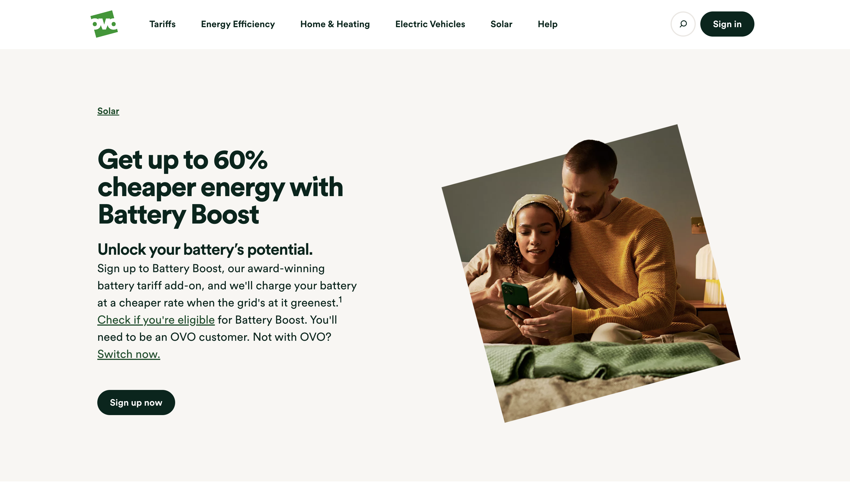
Battery Boost sign-up
Battery Boost sign-up
Redesigning the journey to make linking a solar battery to an algorithmic tariff simple and secure
1 / Problem
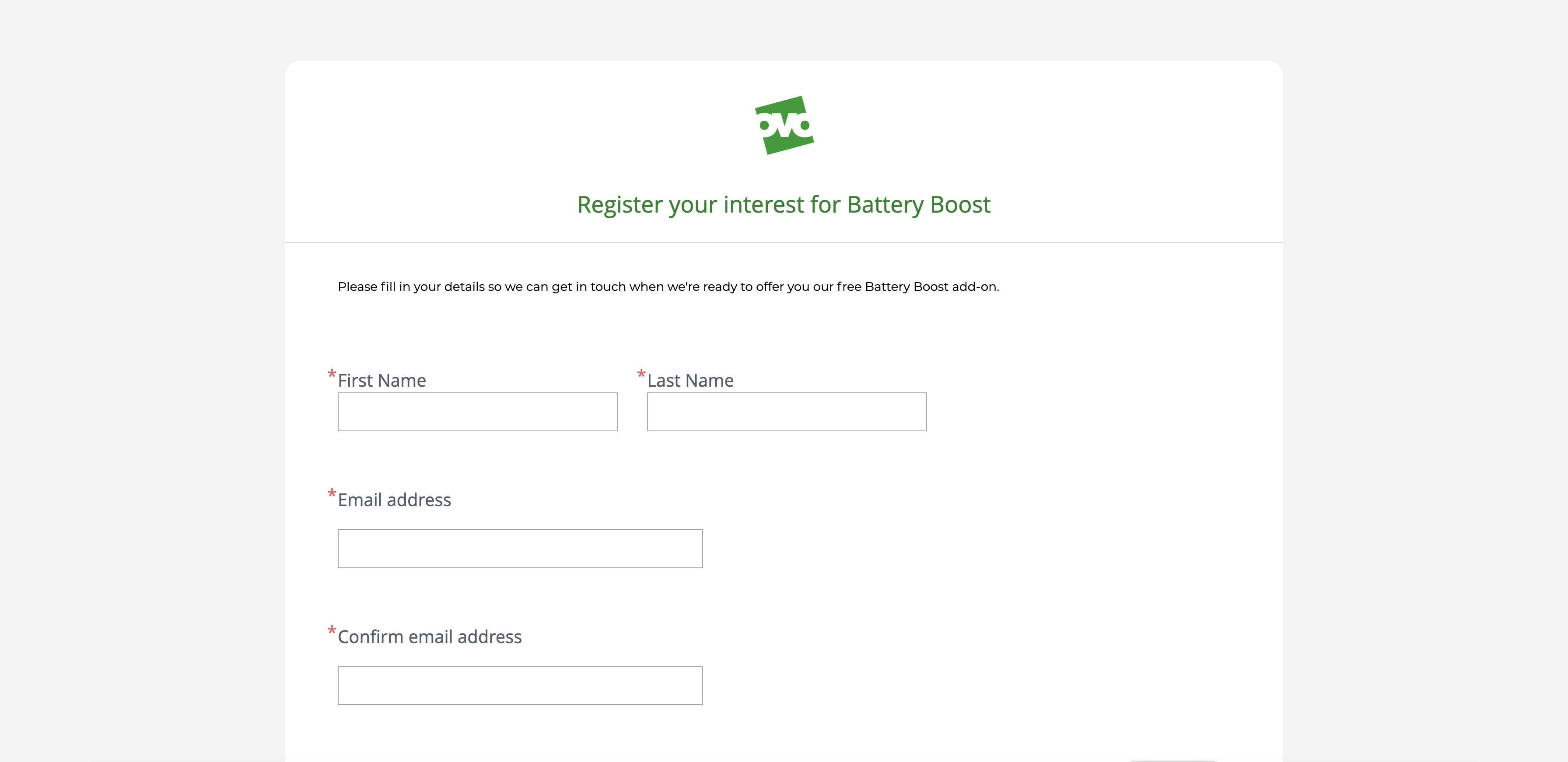
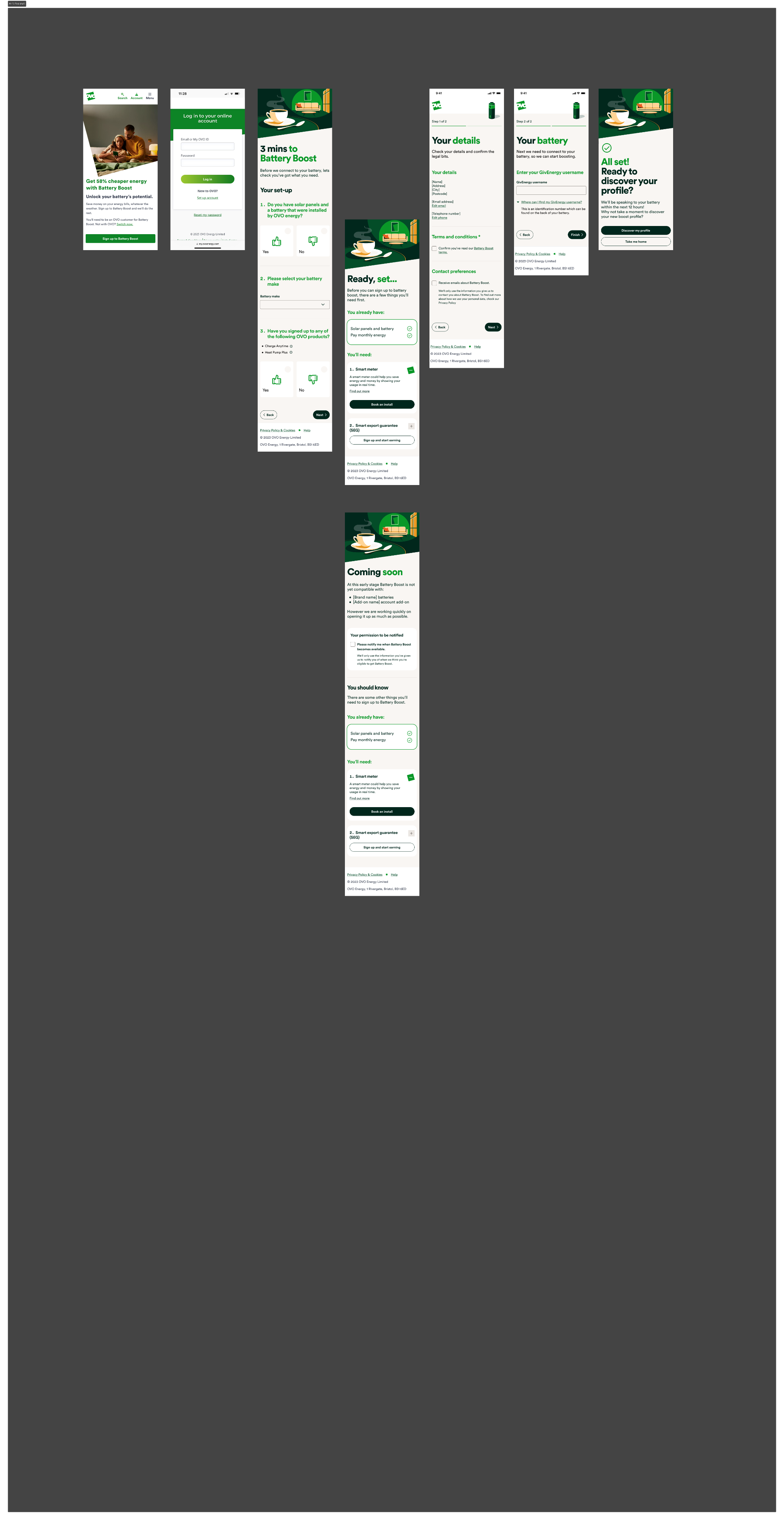
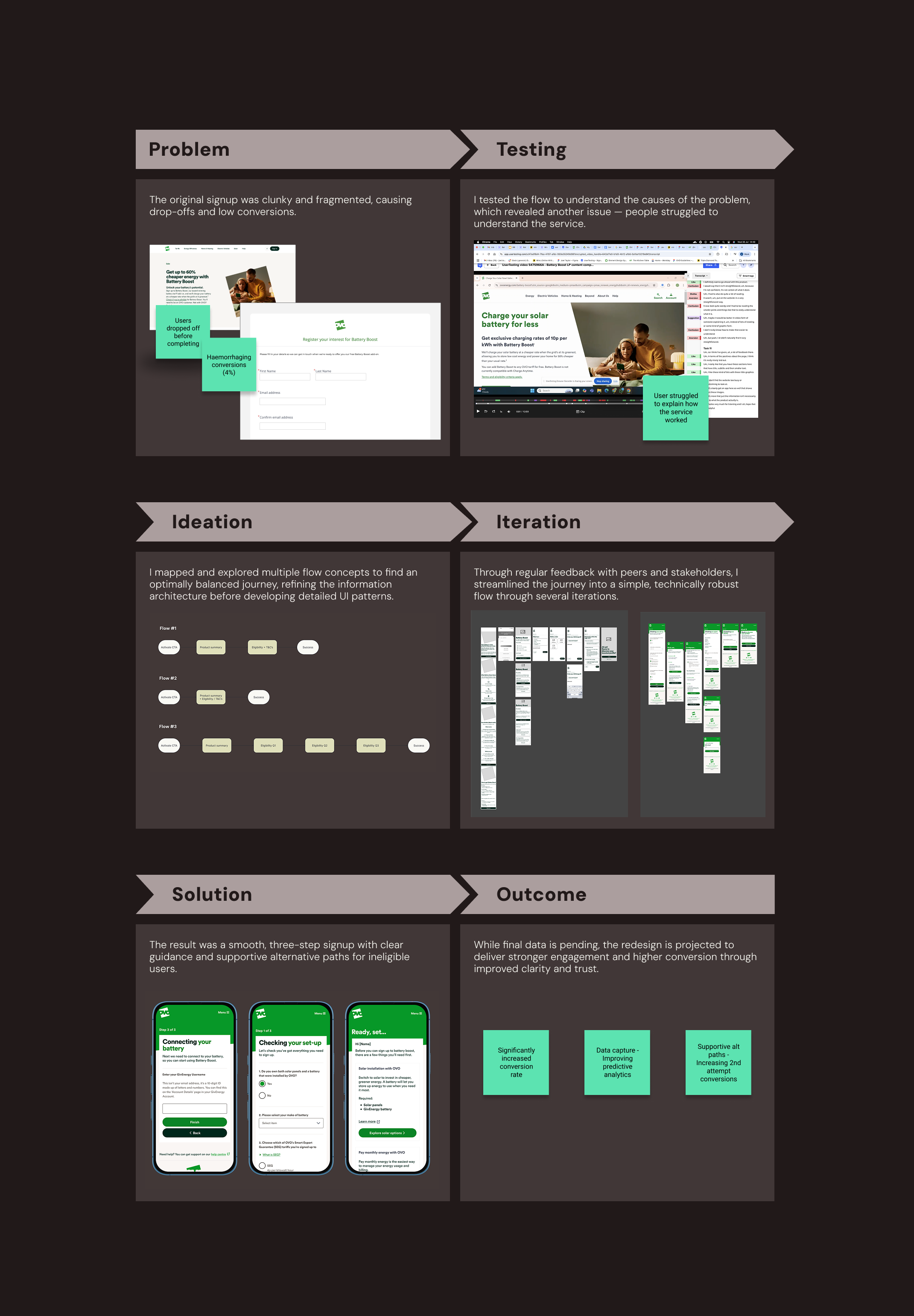
The old signup was disjointed—manual, split across multiple form entries, and haemorrhaging users along the way. We needed a smooth, and simple journey that successfully communicated this new and complex service concept.

Users dropped off before completing
Haemorrhaging conversions (4%)
+ + +
2 / Testing
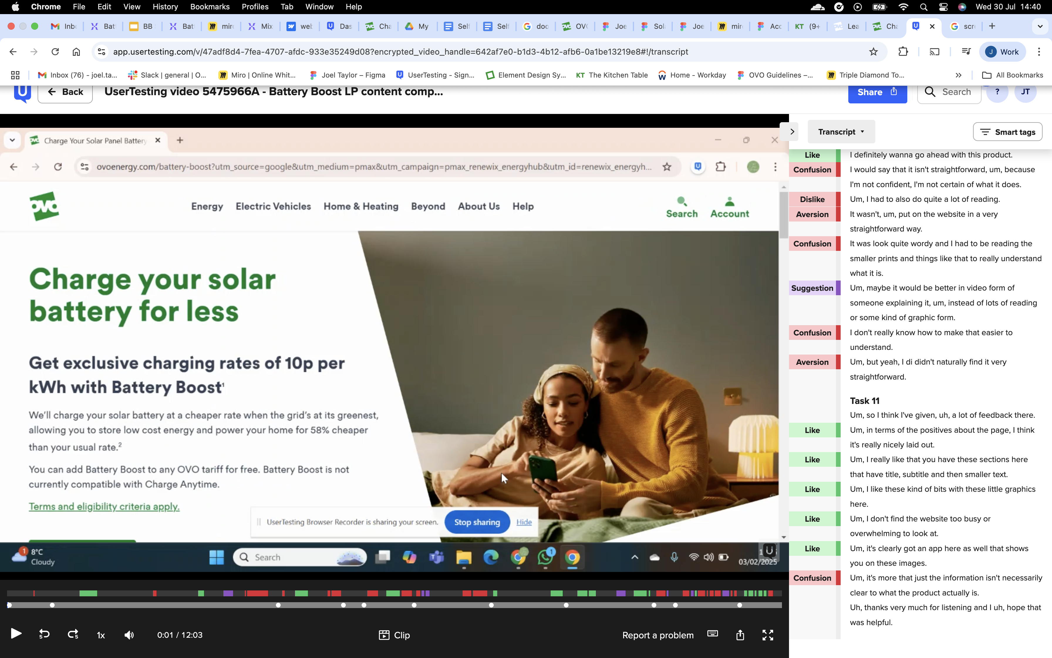
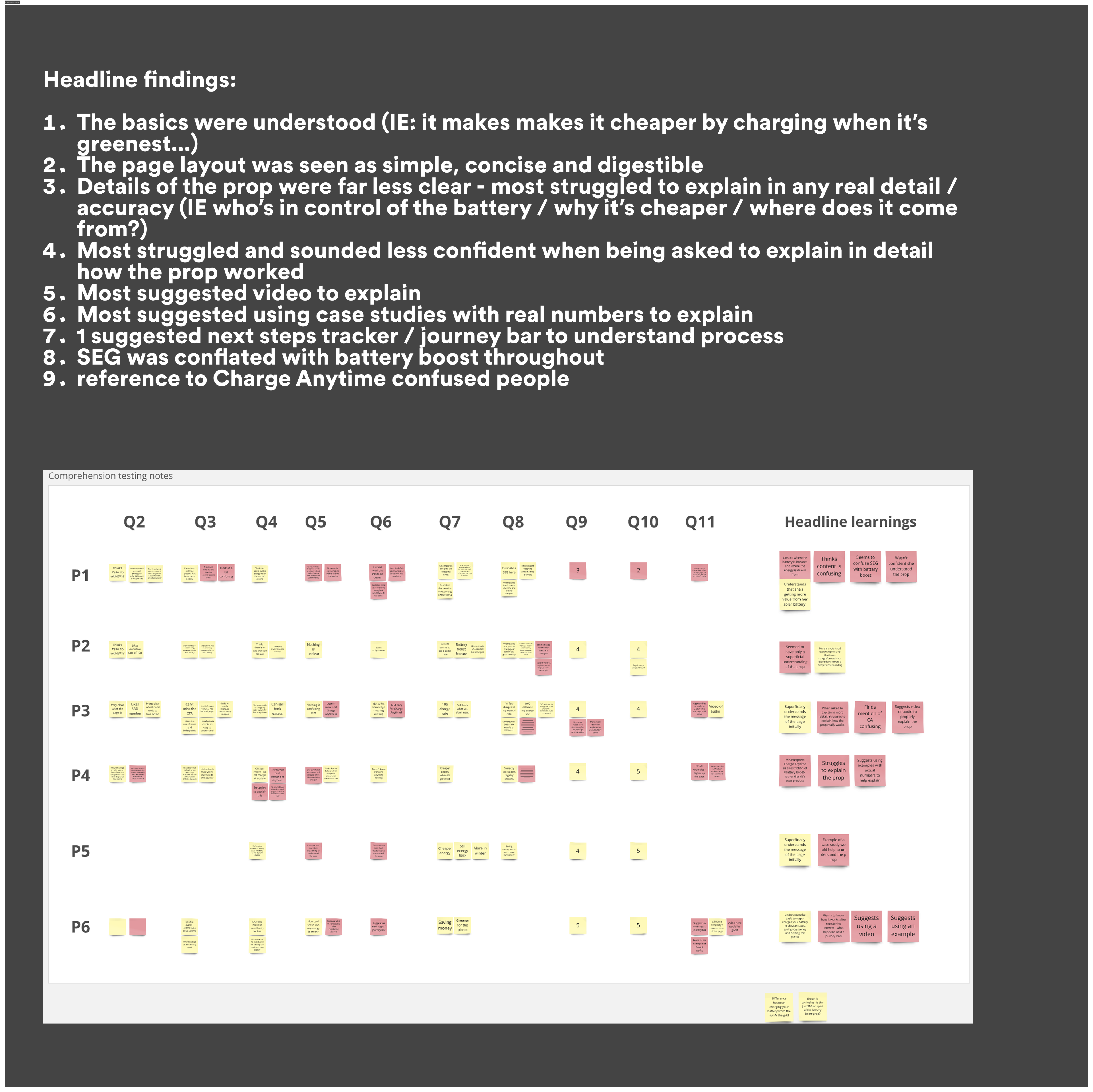
I ran unmoderated usability tests to understand how users responded to the existing content. Which revealed another issue — they were struggled to understand the service.
+ + +
3 / Design
I mapped and explored multiple flow concepts to find an optimally balanced journey, refining the information architecture before developing detailed UI patterns.
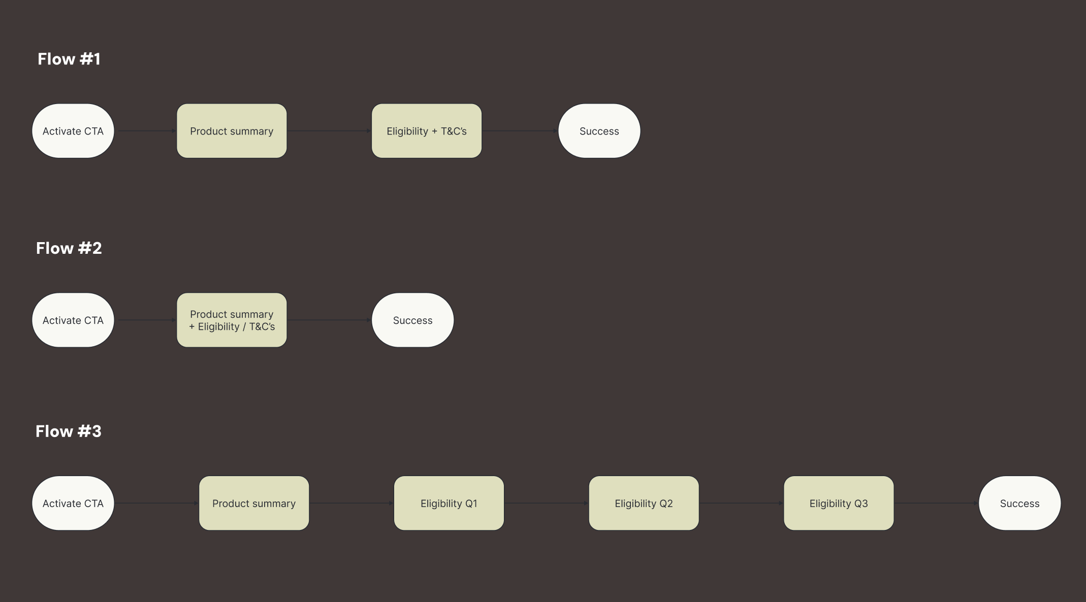
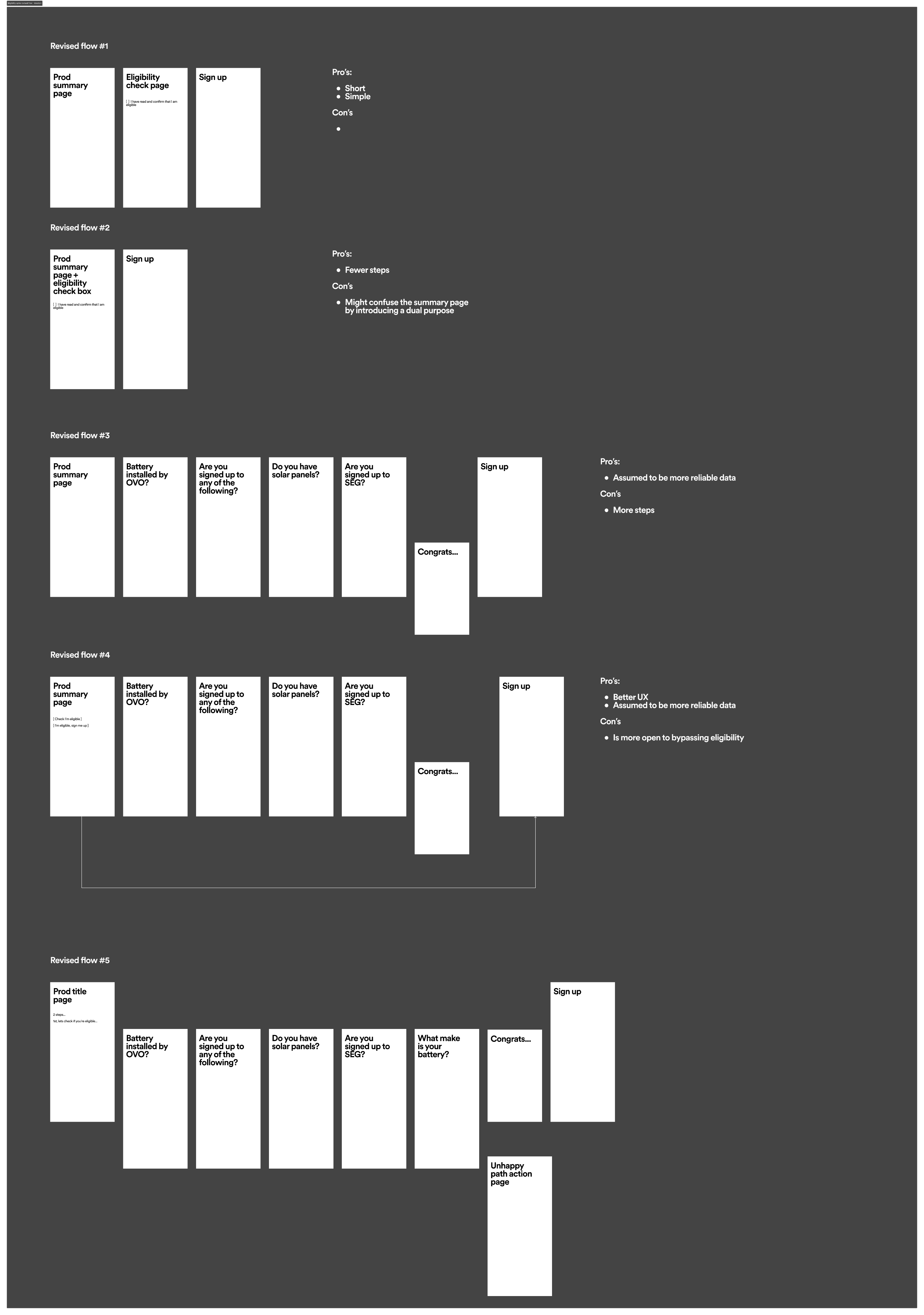
To spark creativity, I pulled inspiration from industry and tech leaders and wire-framed the most suitable patterns.
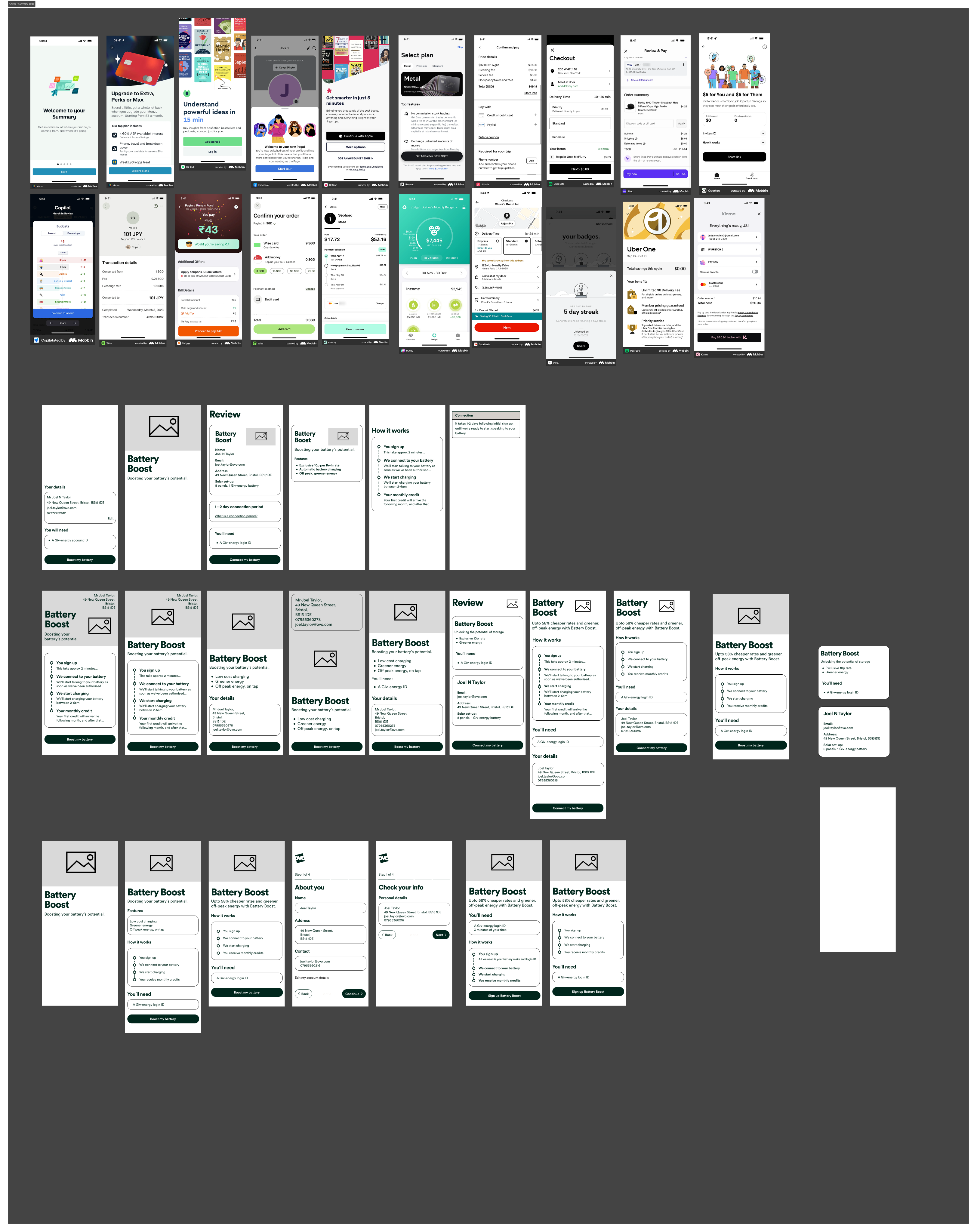
Through continuous feedback with peers and stakeholders, we iterated toward a flow that was simple yet technically robust.
I focussed on reducing steps, adding supportive content, and ensuring each screen clearly explained both the process and the value of Battery Boost.
+ + +
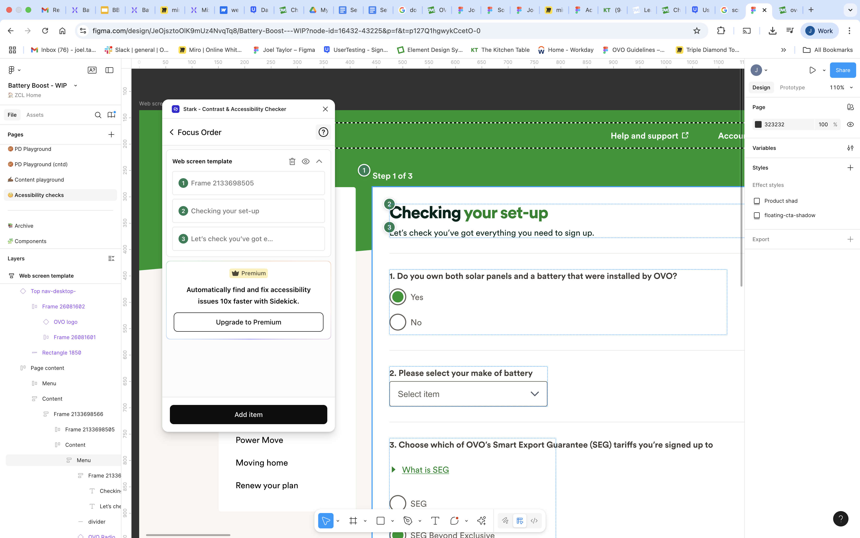
4 / Accessibility
Accessibility was baked in from the start: AA contrast checks (Stark), clear landmarks, logical focus order, alt text, and 44px AAA touch targets. I also guerrilla-tested the prototype with a screen reader in Figma, fixing issues early.
+ + +
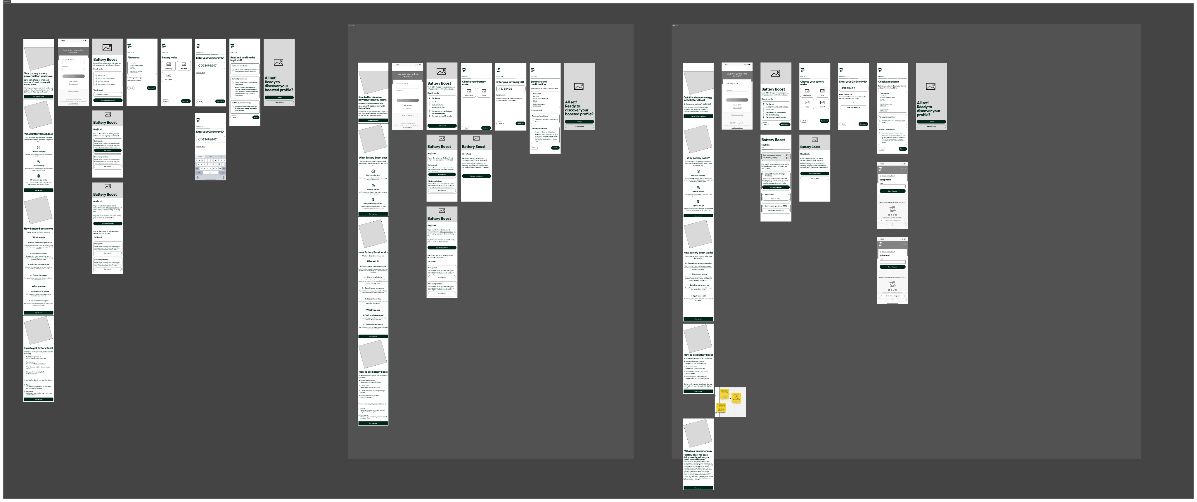
5 / Solution
The final design inspired confidence, sold OVO’s value, and addressed the key user questions—cost, savings, hardware, and process—while keeping visuals clean and engaging.
+ + +
6 / Outcome
The final design delivered a smooth, secure signup journey with fewer steps, clear explanations, and supportive content to build trust. The flow balanced technical requirements with user needs, making the process easy to complete.
+ + +
7 / Reflection
This project demonstrated the importance of rigorously testing content, particularly when introducing users to complex energy products. If I had more time, I’d run A/B tests on different content tones to measure their impact on trust and explore alternative methods of battery connection.
Next case study


BatteryBoostsign-up
BatteryBoostsign-up
Redesigning the journey to make linking a solar battery to an algorithmic tariff simple and secure
My design process at a glance
+++
+++
To spark creativity, I pulled inspiration from industry and tech leaders and wire-framed the most suitable patterns.
Through continuous feedback with peers and stakeholders, we iterated toward a flow that was simple yet technically robust.
I focussed on reducing steps, adding supportive content, and ensuring each screen clearly explained both the process and the value of Battery Boost.
+++
+++
+++
+++